Natural Gas Curve Compression: Does It Tell Us Anything?
As technicians, we look at various measurements of price action to guide decisions regarding future direction. Daily, weekly, and monthly are terms regularly tracked for individual trading months, calendar year strips, and other specific pieces of the forward curves as needed. Natural gas is the primary focus as it has the biggest impact on procurement for our clients, but also followed is the value of generation (and capacity in ERCOT), and the product of these two curves (natural gas X heat rate), wholesale power. All of these values are transparent, either through exchange-traded venues (NYMEX or ICE for natural gas and some power pricing) or bilateral pricing platforms for heat rates and wholesale power (OTC broker platforms). These are financial instruments and define where buyers and sellers agree to trade.
Examples of what we follow include:
Daily natural gas spot month (NYMEX May 2017), daily natural gas spot continuation month, calendar years (NYMEX Cal 2018 and stacked forward curves), stacked heat rates by calendar years (ERCOT North Zone), and Wholesale power prices (ERCOT North Zone):


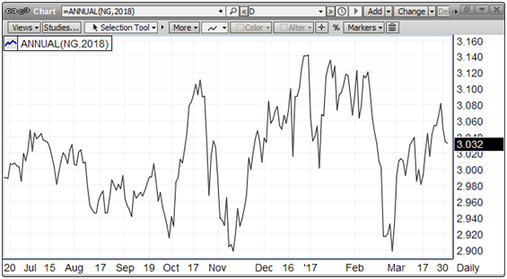

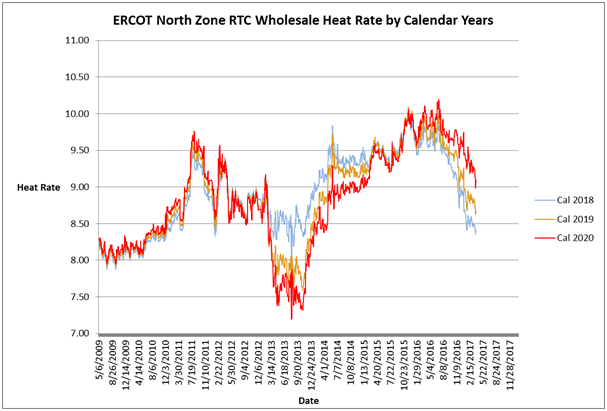

These charts paint a picture of where support and resistance was and is. It also gives a 30,000 foot view that helps us in regards to any trend changes or continuations. By comparing natural gas (the feedstock) to heat rate (generation cost), we can better see what’s going on in each component curve that defines their product, wholesale power price.
Fundamentalists (those who make decisions based on supply/demand balances, weather, infrastructure, and other “things”) will often arrive at the same conclusions technicians do. It’s a product of how good the analysis is and what you’re looking for. We respect this expertise but prefer the look. Whatever works for you is a good answer.
There are other collateral studies that aid in decision making. The reason for this discussion is one such study. It compares the value of the various calendar strips to some benchmark, in this case a specified calendar strip. We have found that historically the relative expansion/compression in a chart can signal strength, weakness, or impending trend change. The differential between each strip indicates how much value is in the front of the curve. If there’s a wide spread, it may mean that deferred prices reflect the “cost of carry” for buying prompt, paying to store it, the cost of money, and insurance required for the term selected. If the result is a positive number, then the strategy may be employed. It may also reflect a “status quo” perspective of price relationships, i.e., the current trend is going to continue. However, what does a compression of these values tell us (if anything)?
We are currently in a period of noticeable compression as the charts below depict:


Every time we have witnessed this type of price action, we have seen a trend change. Looking at natural gas charts and wholesale power charts, we find the same compre4ssion, beginning at the end of 2016. The episode of compressed values is 3+ months old, a longer term than previously experienced. Does this tell us anything? Could it be that this is the new norm? Could this mean that the change will be dramatic? Our view is that change is coming and direction is to the upside. This is our answer to the question of “does curve compression tell us anything?”